
10 Design Disasters You Have to See to Believe
Who signed these design disasters off?
We’ve all been there. When you’re on your third proof and you’re not sure if you can look at the same thing one more time but then, there it is. A glaring error. So it was all worth it. We thank our lucky stars that here at Blimey we’re expected to be as thorough as we are resourceful. But what happens when you don’t do that third proof? Well, this is what happens….
- Preston Trail Goes Latin
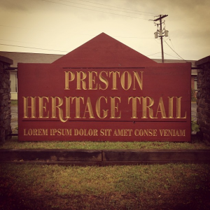
This is a particularly difficult one for those acquainted with Lorem ipsum text. Placeholder copy is an everyday occurrence and consequently most live in abject terror (this may be an exaggeration) that they will one day fall prey to the same mistake as the poor designers of the Preston Heritage Trail sign.
- Reflection Fail
Sorry, what do you want us to do on holiday? Think we’ll stick to sunbathing, sightseeing and sangria drinking, if this designer promises to stick to non-reflective fonts. Deal?
- Less Than Perfect Advertising
![]()
That moment when you see your new vans and you just love the design. Then the door slides open and you realise you have a whole fleet of vehicles with the worst possible review of your company. Our Senior Designer’s advice? Always check your medium, people.
- Punctuation Is ALWAYS Essential
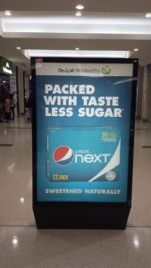
Copywriters beware! If you haven’t read ‘Eats, Shoots and Leaves’, now is the time. Punctuation will be your salvation when it comes to statements like this.
- We Feel Bad For The Horse

Now, Photoshop is evidently every Graphic Designer’s best friend but this takes it a tad too far, in our opinion. It looks like a scene from The Godfather.
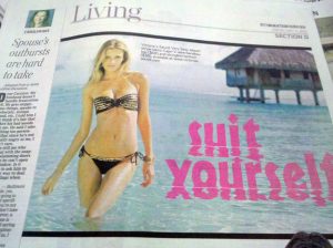
- Fonts Can Be Your Downfall
We cannot emphasise this strongly enough. Always. Check. Your. Fonts. You might say only a certain kind of mind would see it, but we couldn’t even feature some of the font fails we’ve seen over the years.
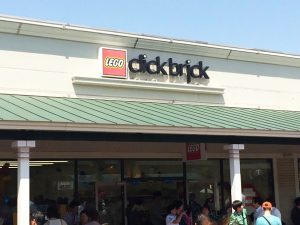
- Similarly, There’s Spacing…
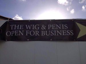
If you’re like us, it’ll take you a minute to even realise what it is that’s actually opening.
- College of What?
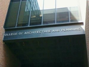
Oh, the irony. Do we even need to mention the college? Well, we’ve mentioned it now but these guys probably should have been paying a bit more attention.
9. Slightly Inappropriate Placement
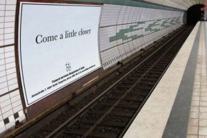
Above a live train track isn’t where you necessarily want to pop this advert. Lesson learnt: Placement is always key.
- We’re Still Trying to Figure This Out
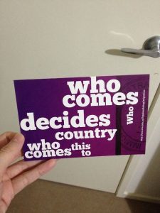
Of all the design disasters, this takes the biscuit. Tweet us if you know because honestly, it’s a head-scratcher.