The Brief
Looking to rebrand, JCP Developments approached Blimey to design and roll out their new corporate identity that would realign its appeal with its new premium vision. With a refocus on delivering design led homes to professional couples and families within the East Midlands, JCP Developments needed a comprehensive rebrand, complete with branded online and offline assets.
The Solution
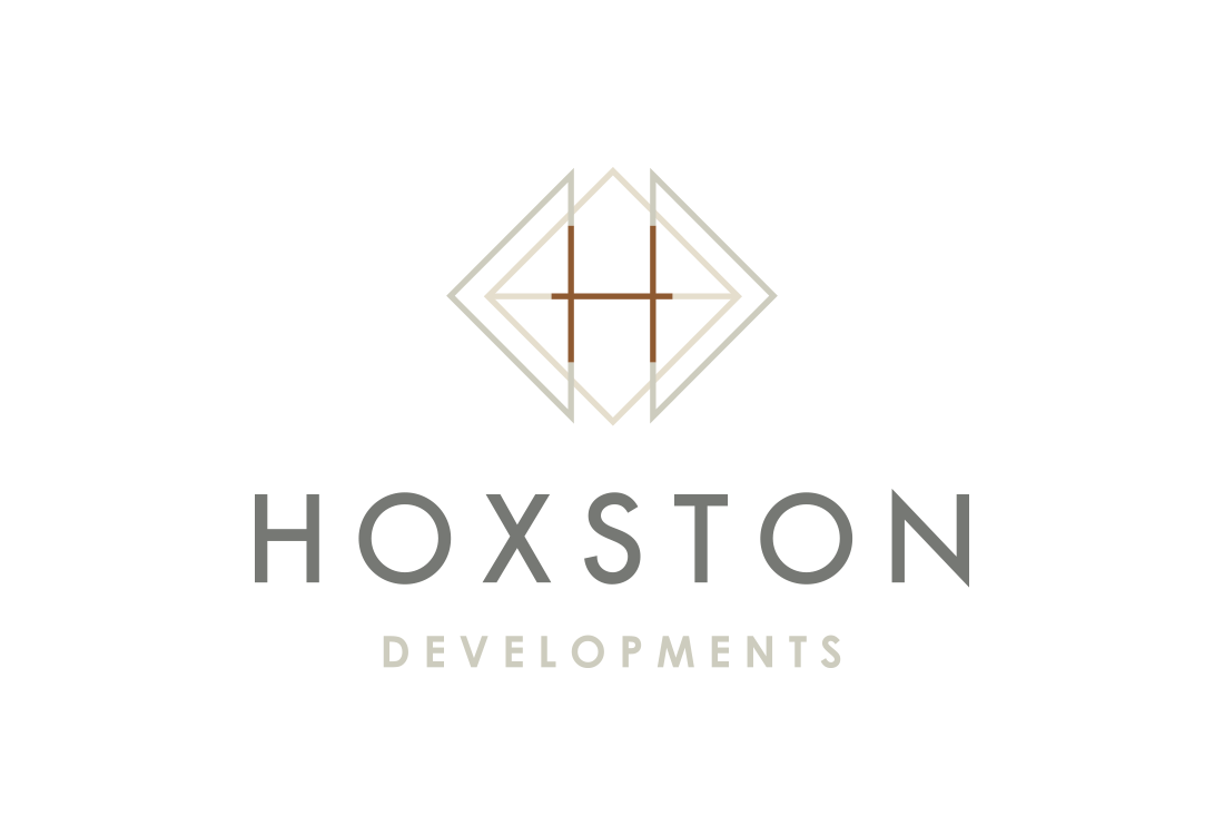
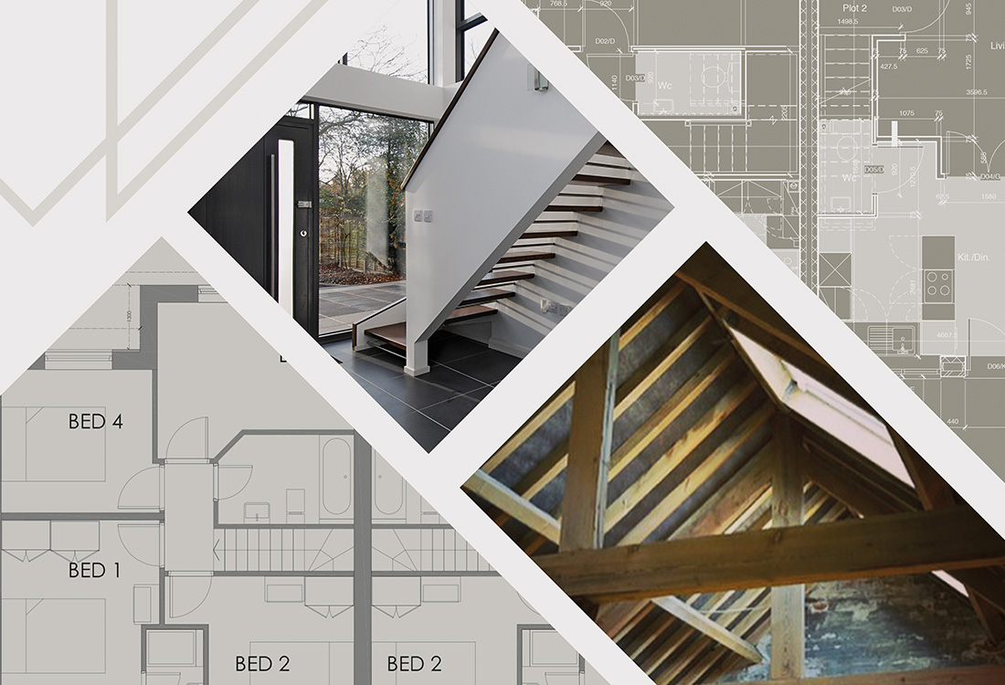
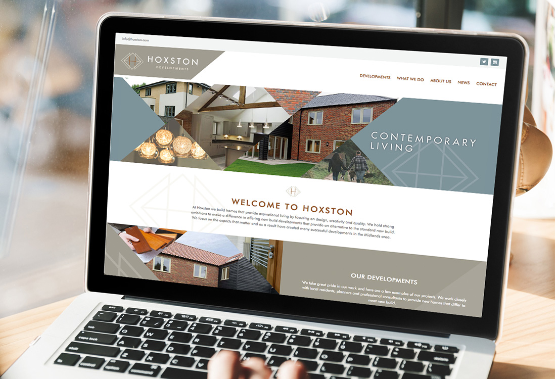
Inspired by the geometric shapes and angles found within a houses structure especially within the roof and support trusses, Blimey developed the Hoxston Developments identity that used linear shapes and intersecting lines to form a logo influenced by property blueprints and site plans.
A classic sans serif font was chosen, to reflect the quality and premium standard of the developments, whilst the secondary font echoes the sturdy and assured style of the properties produced. A muted palette then aligned the brand with its signature sympathetic developments that aim to enhance the landscape rather than disrupt.
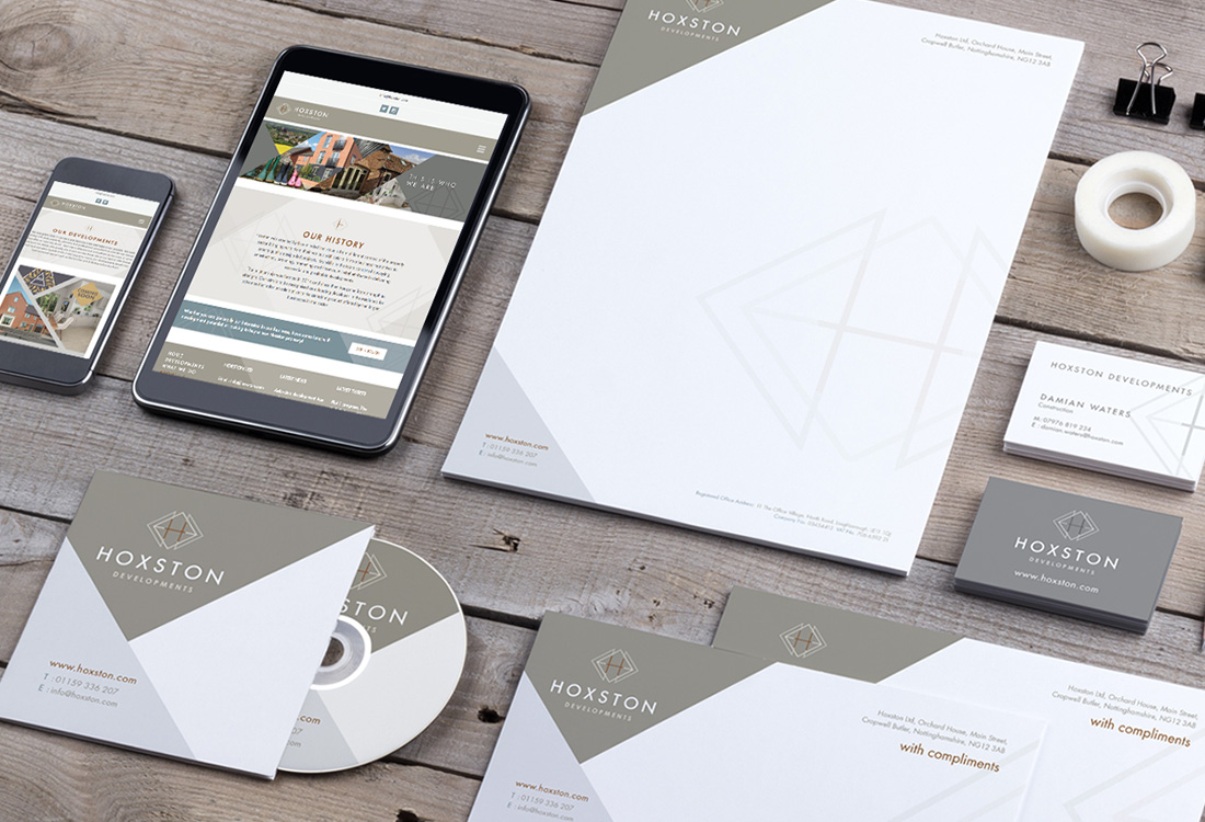
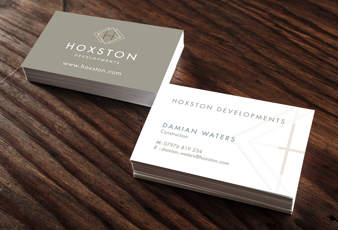
Once the identity was established, a full suite of stationery, hoarding and brochures were designed in similar geometric high-end styling, with the supporting website designed and built ready for the developers next project launch.
The Results
With the rebrand fully launched, the new vision and premium positioning were realised with Hoxston Developments going on to sell all its available properties off-plan, even before site construction was complete. Continuing to work with the premium developer, Blimey have gone on to develop two further development identities.